At about 7:30 am this morning I was having a brief pause on my breakfast just to look at the website I now visit habitually recently: the real-time dashboard tracking coronavirus cases, run by thebaselab.

Today I saw that the number of people killed by the virus has nearly reached a perplexing 6,000 since the start of the outbreak over 3 months ago. Contemplating back at how diligent and somewhat rigorous the Vietnamese authorities have initiated, the alarm is understandable.
I found a dataset called ‘Novel Corona Virus 2019 Dataset’ on Kaggle, contains daily information on the number of cases, deaths and recovery so I thought I would create some exploratory data analysis (EDA) and data visualisation using Python!
EDA is an approach to analysing data sets — a critical process of conducting preliminary exploration into the data. If you are interested in understanding more EDA, this is my previous article.
Before we get started
Data
The data set, ‘covid_19_data.csv’, carries the following columns:
Sno — Serial Number ObservationDate — Date of the observation in MM/DD/YYYY Province/State — Province or state of the observation Country/Region — Country of observation Last Update — Time in UTC at which the row is updated for the given province or county Confirmed — Cumulative number of confirmed cases until that date Deaths — Cumulative number of deaths until that date Recovered — Cumulative number of recovered cases until that date Package
I assume you’re familiar with python. But even if you’re relatively new, this tutorial shouldn’t be too tricky.
You’ll need seabornand pandas.Install them (in your virtual environment) with a simple pip install [PACKAGE NAME].
Now hold my hands and let’s get started together.
EDA and data visualisation
Firstly, we will read the data into a Pandas data frame:
import pandas
df_corona = pandas.read_csv('covid_19_data.csv', index_col=0 )
You may have heard about pandas a lot, as it probably is the most popular library for data analysis in Python programming language. I use pandas on a daily basis and really enjoy it because of its eloquent syntax and rich functionality.
The index_colparameter specifies to pandaswhich column is to be used as the index since loading CSV files without this parameter can lead to duplication of index columns.
Now let’s have a quick glance on the dataset by printing the first five rows of data.
df_corona.head()
Or by telling pandas to describe the data for us 🙂
df_corona.des()Which will return the general stats of the numeric columns in the dataframe:

On average, there are 623 confirmed cases, 21 deaths and 231 recovered cases per day.
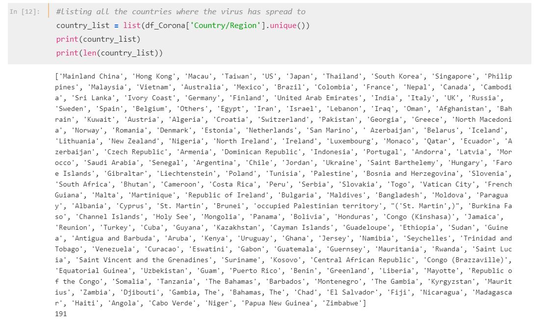
#countries where the virus has spread to
country_list = list(df_Corona['Country/Region'].unique())
print(country_list)
print(len(country_list))
The data shows that the virus has spread to 191 countries across Asia, Europe and America.
So far, no mystery, right?
Now let’s create some data visualisation based on different aspects of the data set.
#1: Number of Confirmed cases over time
#normalise the date
df_Corona['ObservationDate'] = pandas.to_datetime(df_Corona['ObservationDate'])
df_Corona['ObservationDate_new'] = df_Corona['ObservationDate'].apply(lambda x:x.date())
#plotting a bar chart of confirmed cases over time
Confirmed = pandas.pivot_table(df_Corona, index ='ObservationDate_new',
values=['Confirmed']
,aggfunc = numpy.sum)
seaborn.set_palette("husl")
fig1= Confirmed.plot(kind='bar', figsize =(30,10))
plot.xticks(rotation=60)
plot.ylabel('Number of confirmed cases',fontsize=35)
plot.xlabel('Dates',fontsize=35)
#2: The race between deaths versus recovered cases
#plotting a bar chart of recovered cases over time
Recovered_Deaths = pandas.pivot_table(df_by_date, index ='ObservationDate_new', values=['Recovered', 'Deaths']
,aggfunc = numpy.sum)
Recovered_Deaths.plot(kind='bar', figsize =(30,10))
plot.xticks(rotation=60)
plot.ylabel('Number of cases',fontsize=35)
plot.xlabel('Dates',fontsize=35)
plot.legend()
#3: Firstest with the mostest — most affected countries besides China
#We know that China is the most affected country by a large margin, #so lets create a bar plot to compare countries other than China
df_country=df_Corona.groupby(['Country/Region']).max().reset_index(drop=None)
df_countrynoChina = df_country[df_country['Country/Region']!= 'Mainland China']
plot.rcParams['figure.figsize']=(15,7)
seaborn.barplot(x="Country/Region",y="Confirmed",
data=df_countrynoChina.nlargest(10,'Confirmed'),
palette=seaborn.diverging_palette(10, 220, sep=80, n=7)
)
plot.ylabel('Number of cases',fontsize=15)
plot.xlabel('Countries',fontsize=15)
plot.xticks(fontsize=13)
plot.yticks(fontsize=13)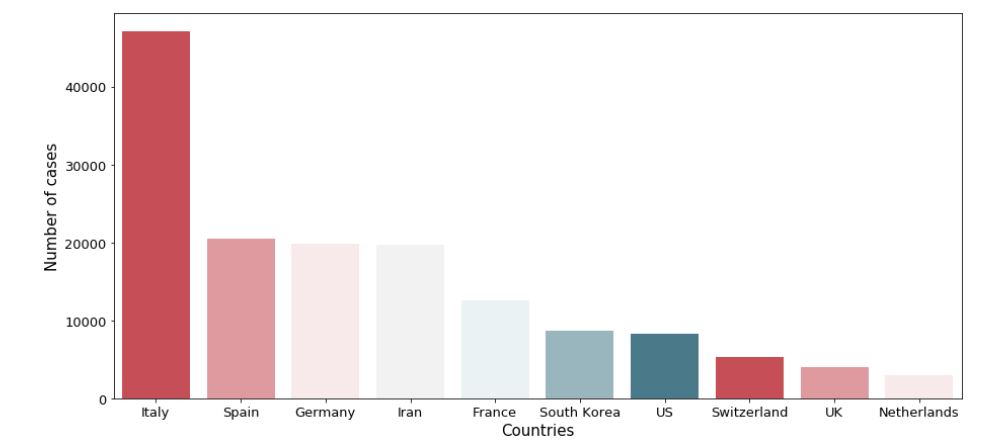
#4: Mortality rate over time
#The mortality rate, at any point in time, can be roughly calculated #by dividing the number of deaths by the number of confirmed cases
df_by_date['mrate']=df_by_date.apply(lambda x: x['Deaths']*100/(x['Confirmed']), axis=1)
plot.plot('ObservationDate_new','mrate',data=df_by_date, color='red')
plot.grid(True)
plot.show()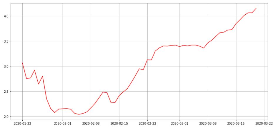
#5: A closer look at the 10 most-affected provinces in China
#creating a separate dataframe for provinces
df_province=df_Corona[df_Corona['Country/Region']=='Mainland China'].groupby(['Province/State']).max().reset_index(drop=None)
#selecting 10 most affected provinces
df_province=df_province.nlargest(10,'Confirmed')
df_province=df_province[['Province/State','Deaths','Recovered']]
#for multi-bar plots in seaborn, we need to melt the dataframe so #that the the deaths and recovered values are in the same column
df_province= df_province.melt(id_vars=['Province/State'])
seaborn.barplot(
x='Province/State',
y='value',
hue='variable',
data=df_province,palette=seaborn.diverging_palette(10, 220, sep=80, n=7)
)
plot.xlabel('Provinces',fontsize=15)
plot.ylabel('Number of cases',fontsize=15)
plot.grid(True)
#6: We can also look at the frequency in Province/State using the ‘Counter’ method from the collections module
from collections import Counter
print(Counter(df_Corona['Country/Region'].values))
Let’s drop the missing values and limit the counter to output only the five most common Provinces:
df_Corona.dropna(inplace=True)
print(Counter(df_Corona['Country/Region'].values).most_common(10))
We can also use box plots to visualize the distribution in numeric values based on the minimum, maximum, median, first quartile, and third quartile.
For example, let’s plot the distribution in confirmed cases for ‘Taiwan’, ‘Macau’, and ‘Hongkong:
import seaborn
import matplotlib.pyplot as plot
df_confirmed = df_Corona[df_Corona['Country/Region'].isin(['Taiwan', 'Macau', 'Hong Kong'])]
seaborn.boxplot(x= df_confirmed['Country/Region'], y = df_confirmed['Confirmed'])
plot.show()
We can do the same for recovered cases:
df_recovered = df_Corona[df_Corona['Country/Region'].isin(['Taiwan', 'Macau', 'Hong Kong'])]
seaborn.boxplot(x= df_recovered['Country/Region'], y = df_recovered['Recovered'])
plot.show()
And for deaths:
df_deaths = df_Corona[df_Corona['Country/Region'].isin(['Taiwan', 'Macau', 'Hong Kong'])]
seaborn.boxplot(x= df_deaths['Country/Region'], y = df_deaths['Deaths'])
plot.show()